Overview
A hotel brand that guests read with their hands: woven motifs, warm copper and wood, carried from the front gate to the key card.
- Brand Strategy & Identity
- Environmental Graphics & Wayfinding
The story
- 01
The brief
CHR was opening Oryn, a hospitality property that wanted to feel unmistakably Indian without falling into heritage cliché. The identity had to work at the scale of a building facade and at the scale of a do-not-disturb tag.
- 02
A language, not a logo
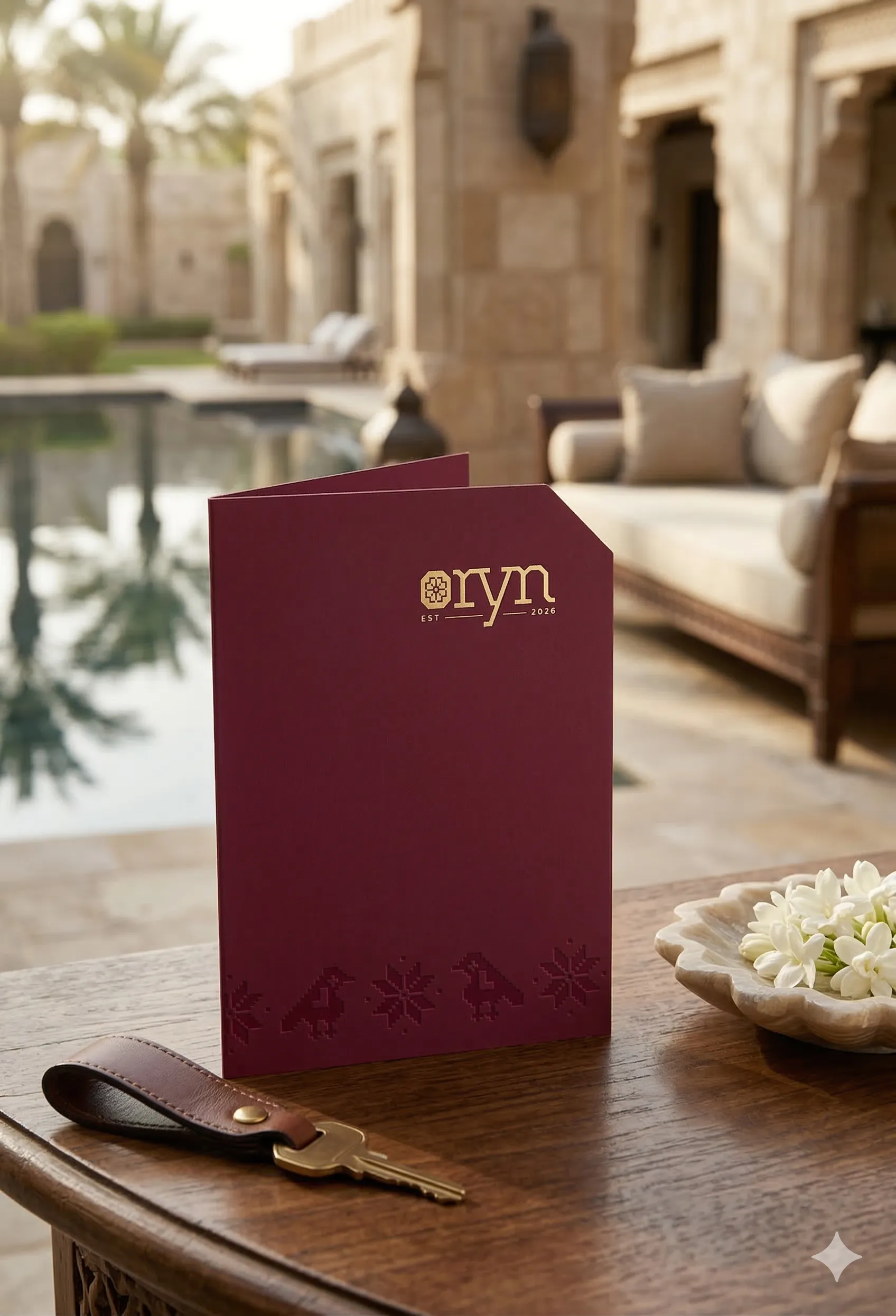
We built a motif bank drawn from Patola and Pochampally weaves, pixel by pixel, so every pattern sits on the same woven grid. The octagonal mark folds that grid into a single emblem, and the wordmark's round o echoes it.
- 03
Colours named for where they come from
Patola Burgundy, Deccan Copper, Pochampally Indigo, Forest Green, Thar Sand, Umber and Ivory. Each one is tied to a material in the building, so print, signage and interiors stay in the same family.
- 04
From the gate to the room
Outdoor logo signage, reception, restroom and emergency exit signs, parking wayfinding, floor directories and wooden room numbers that glow at night. Then the stay itself: key cards and holders, menus, notepads, wifi cards and welcome cards.




Colour
Click a colour to copy its hex.
Typography
- HooverHeadlines and signage
- BiloBody copy and collateral